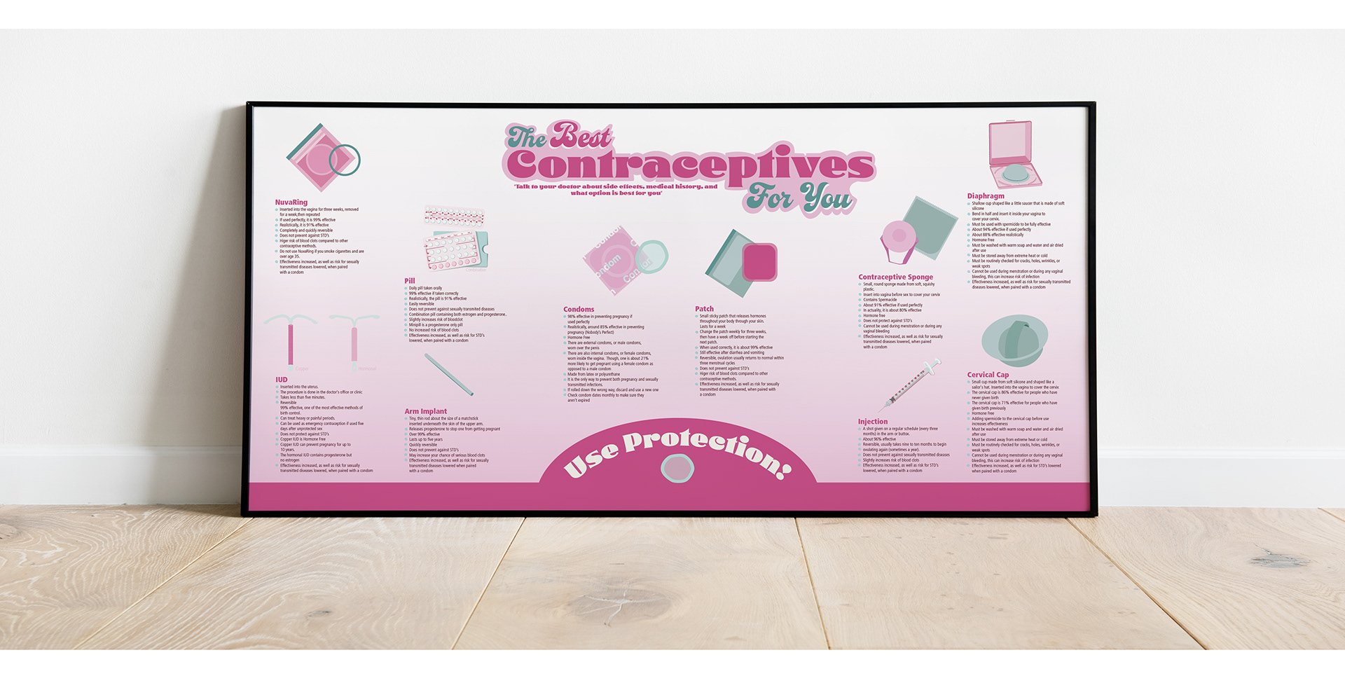
Contraceptives Poster
This poster was created for my Typography I class in undergrad. It spanned across two projects where we were tasked with illustrating elements and designing an informative poster. I decided to design a poster informing people of the different types of birth control that exist.
For the first project that focused only on the illustrations, I looked around for inspiration.


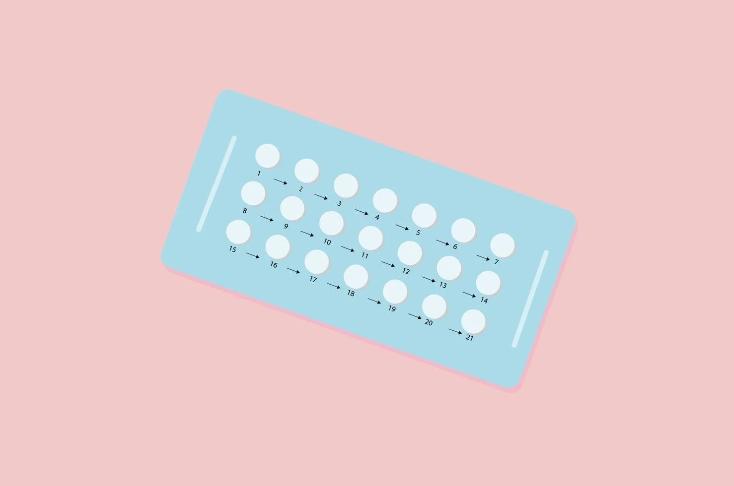


I then had to research methods, side effects, and how each worked. That gave me an idea of how many elements I had to design, which ended up being thirteen.
I wanted the design to be approachable and fun, since contraceptive use is a taboo subject in today’s society. This led me to the pink and blue color scheme, as well as the groovy fonts used in the title of the poster. The only problem with the poster is that it was resembling a pill packet instruction manual, which is overwhelming.

After cutting down a little more information, I decided to add more color, bring some of that groovy font to the bottom of the poster, and replace my multicolored condom bullet points with only blue for contrast. This helped the poster immensely, allowing for more contrast and readability as well as making it more fun and approachable.
