The Dakota Website
In an Interactive Design class during my undergrad, we were tasked with designing a webpage for an apartment website. Though the Dakota does not list openings through their own website, I was drawn to its classiness, decadence, and Victorian architecture. I wanted to see if I could create a webpage that lived up to the iconic building
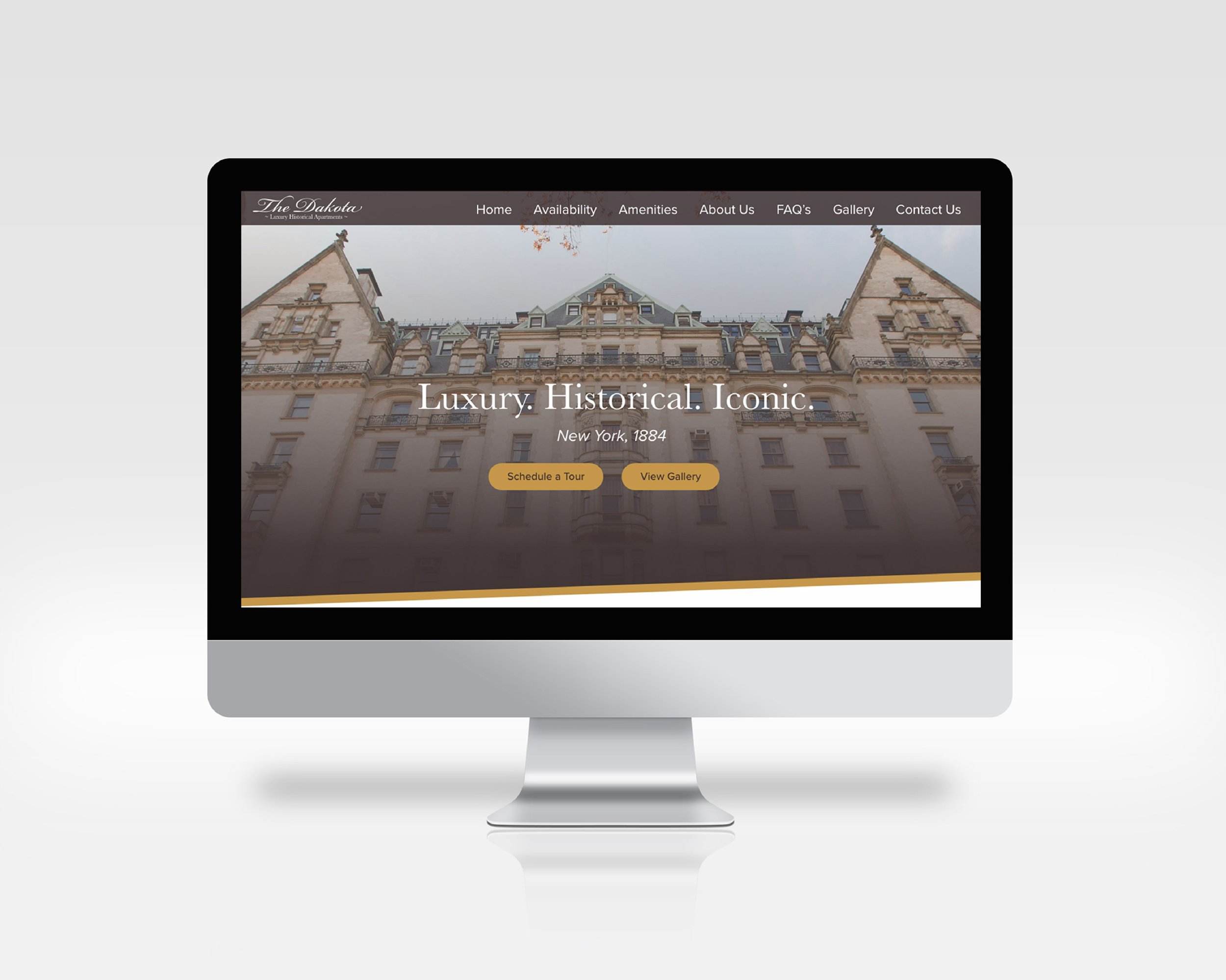
We started in class with laying out a style guide. I kept the richness and decadence of the Victorian era in mind when picking a color scheme, then tried to keep it light and delicate with a script font for the main logo. I then paired that font with a serif font that was easier to read but still called back to a high class Victorian lifestyle. I realized I needed to bring more of the 21st century into my design, so I chose a sans serif font that was clean and classy for body copy on the web page itself. After this, I laid out wireframes and a Information Architecture map to get a better idea of how my website would look and work. This was important, since I wanted it to be as seamless and easy to navigate as possible.


Finally, I was able to lay out all my elements into prototypes. I tried to keep in mind the balance between modernity and the Victorian era, usually using the richer colors when trying to catch the viewer's eye and then switching back to white for the user’s clarity and readability. I always made sure there was something drawing the user to scroll down and interact with the webpage.


