Scapin Poster
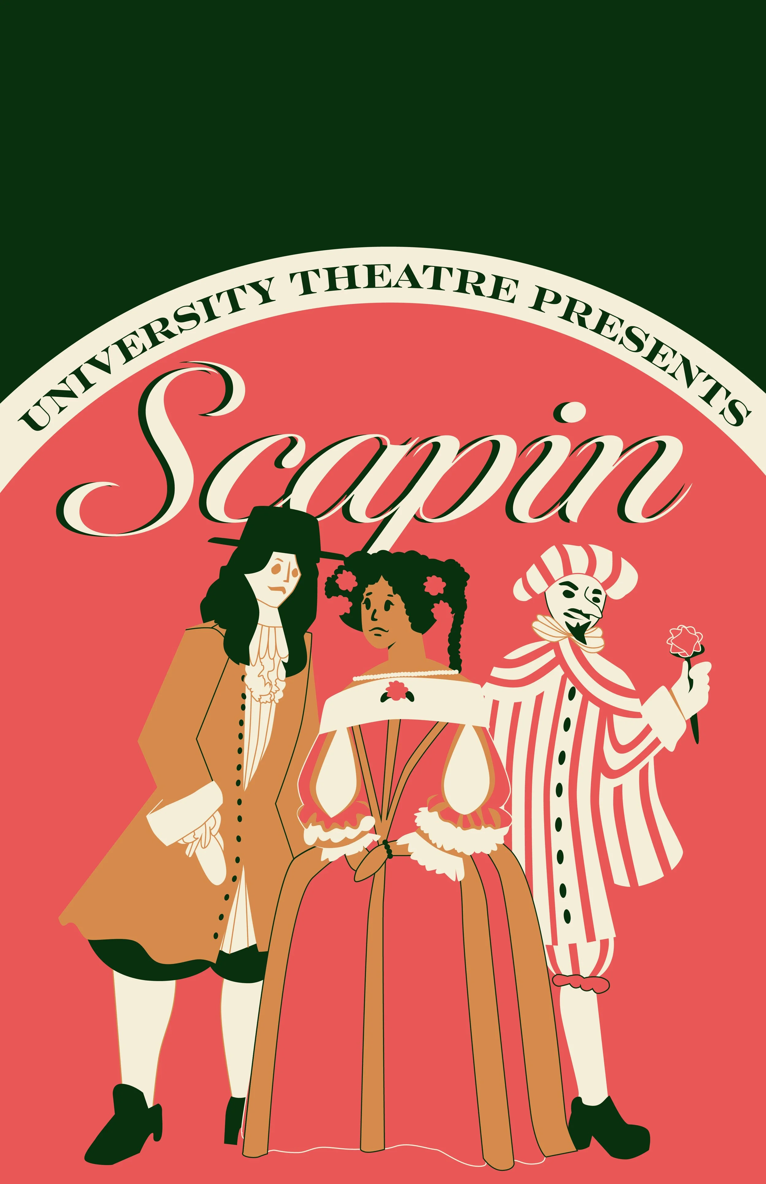
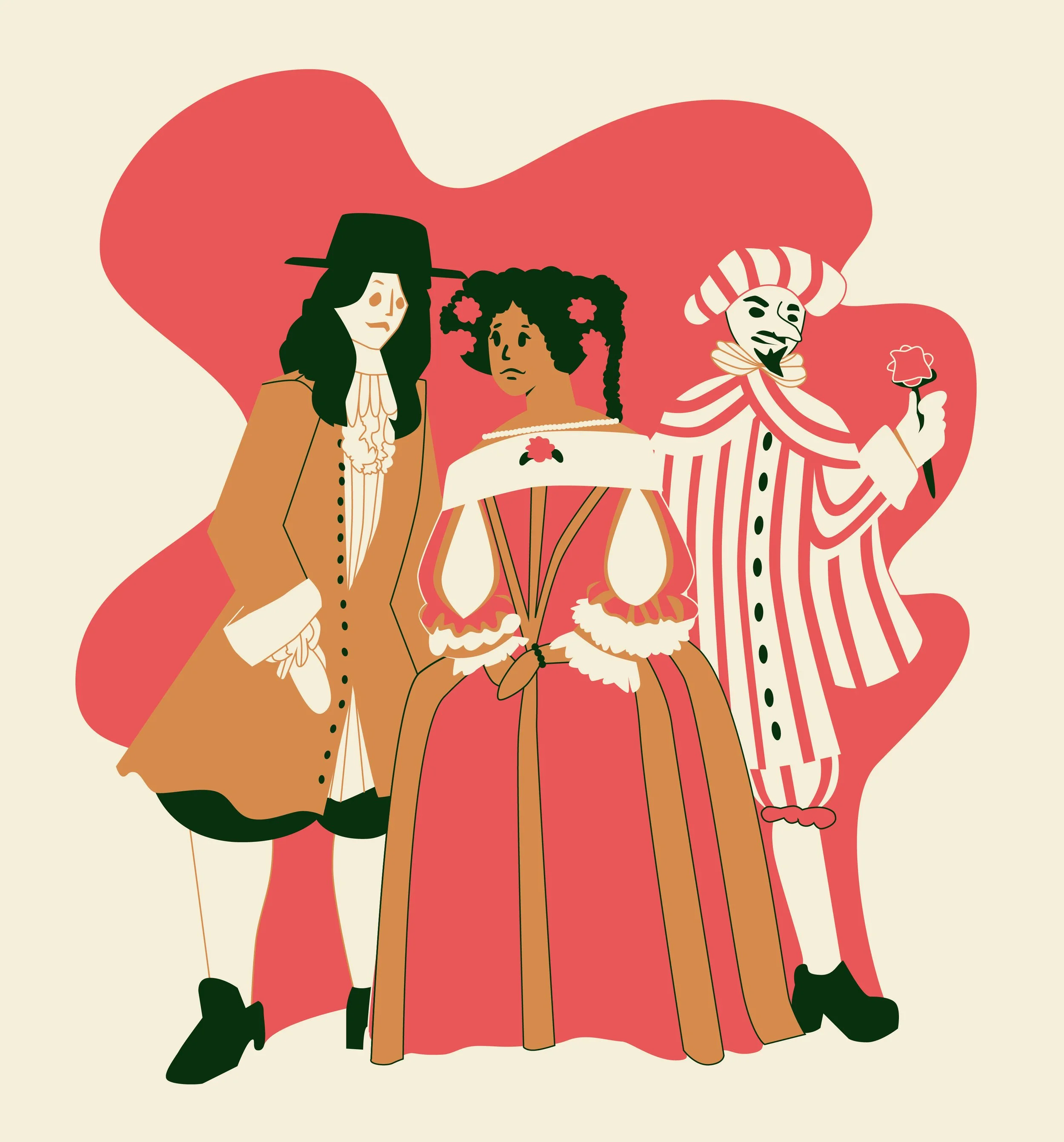
I had the privilege of being able to design material for Youngstown State University’s Cliffe College of Creative Arts. I was tasked with designing a poster for University Theater’s production of Scapin, which taught me a lot about client work. The director of the show sent me a document that said he wanted the 17th century play to have a vaudevillian flair. After reading the play and taking notes on the plot, I decided to look for inspiration. I wanted to play around with 17th century fashion while also keeping it fun and playful. Scapin is a trickster who is using his skills to keep new couples together, so I wanted the poster to be fun and romantic.

I also looked at vintage posters and found I liked the illustrative posters that only used a few colors. I found vaudevillian posters with a similar style among others.
I found a painting of Scapin and Sylvester by Honore Daumier from around the 1860’s that informed me more of the characters personalities.


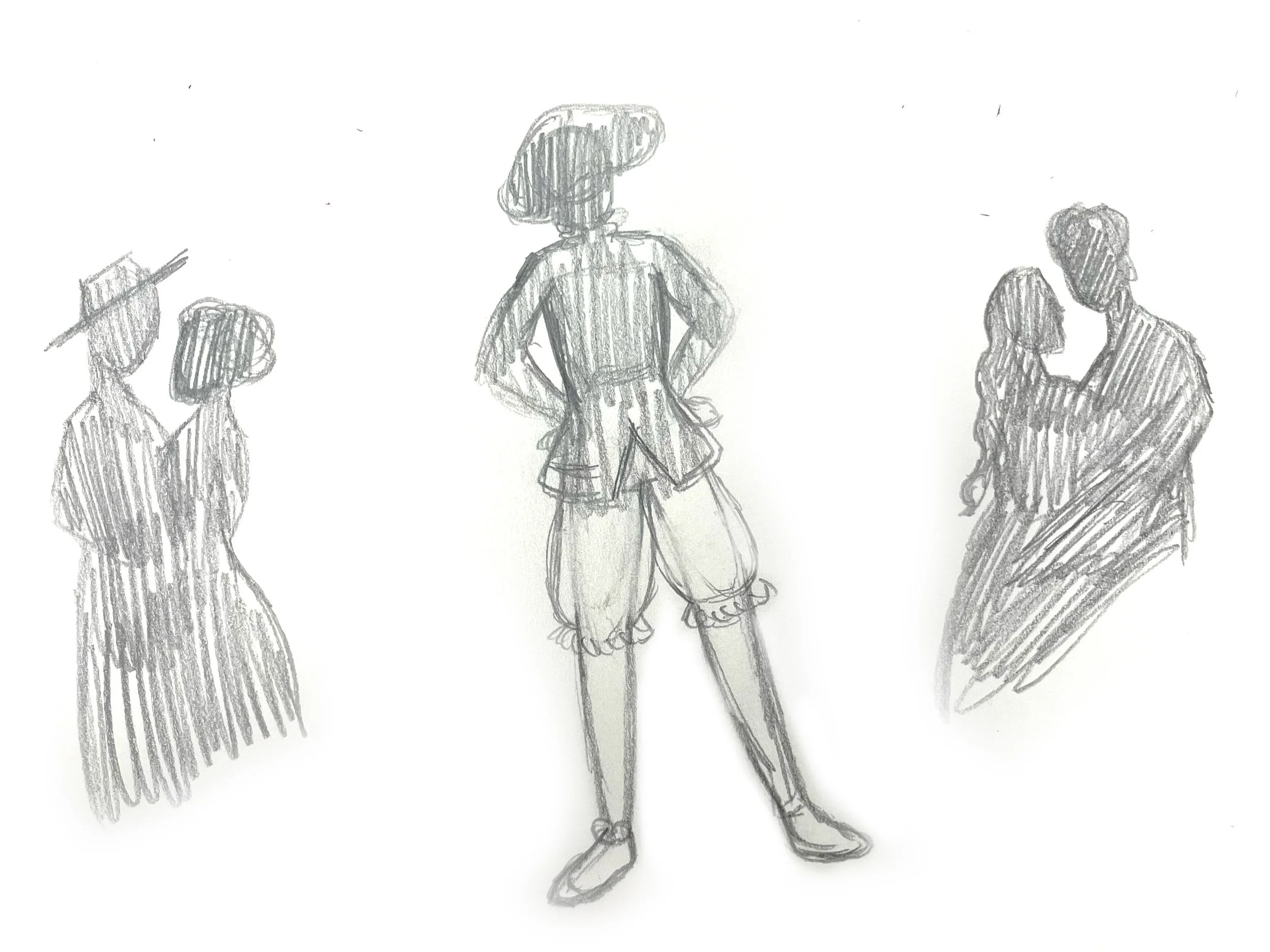
After this, I began sketching out a few ideas. I also looked at historical portraits to get an idea of the fashion of the time, finding Spanish fashion looked a lot more romantic and loose than Italian or French styles. The character, Scapin, also has a specific outfit he wears which is indicative of the 17th century. I ended up sticking with the illustration of the three historically dressed figures to base the rest of my design off of.

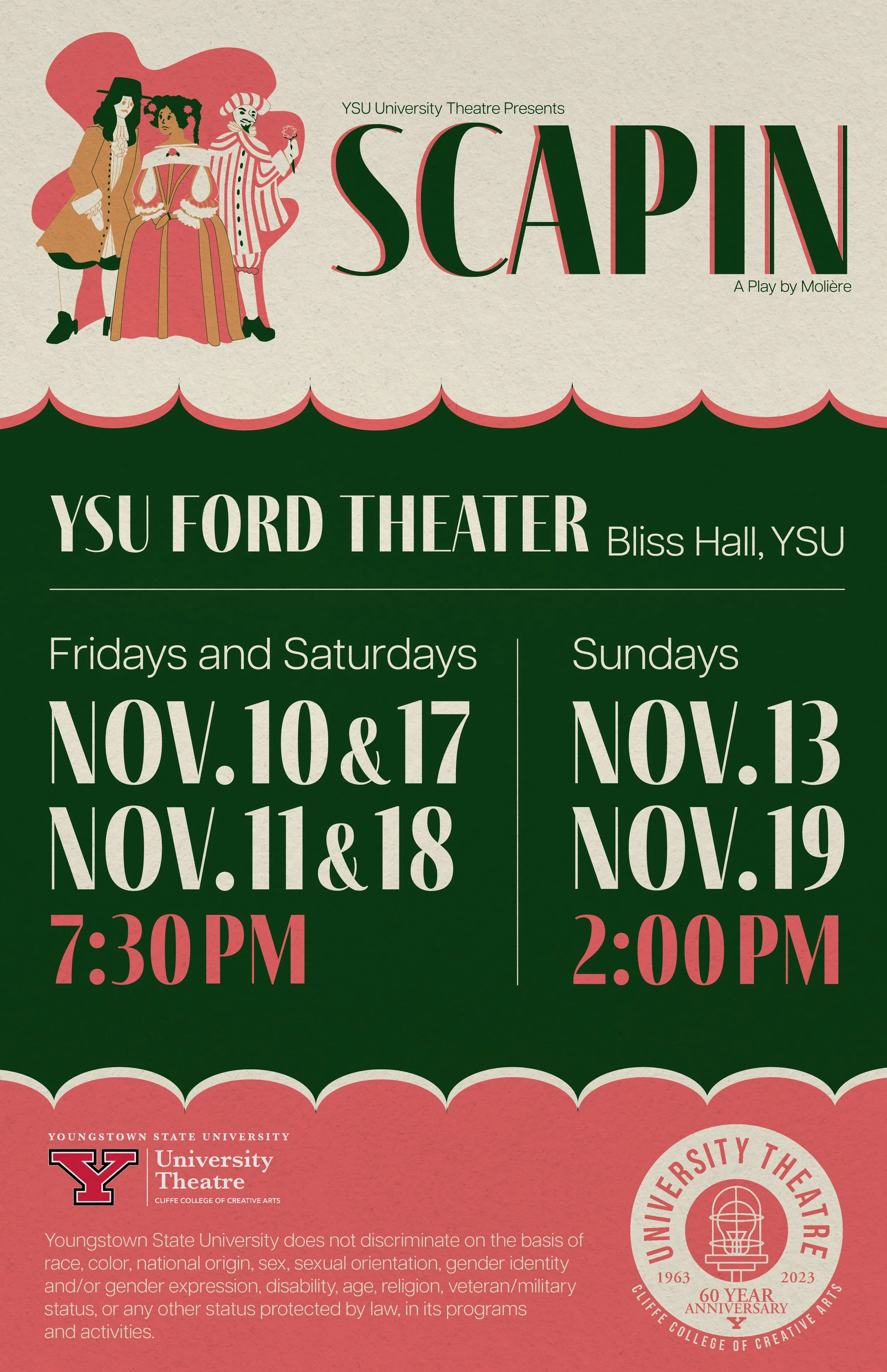


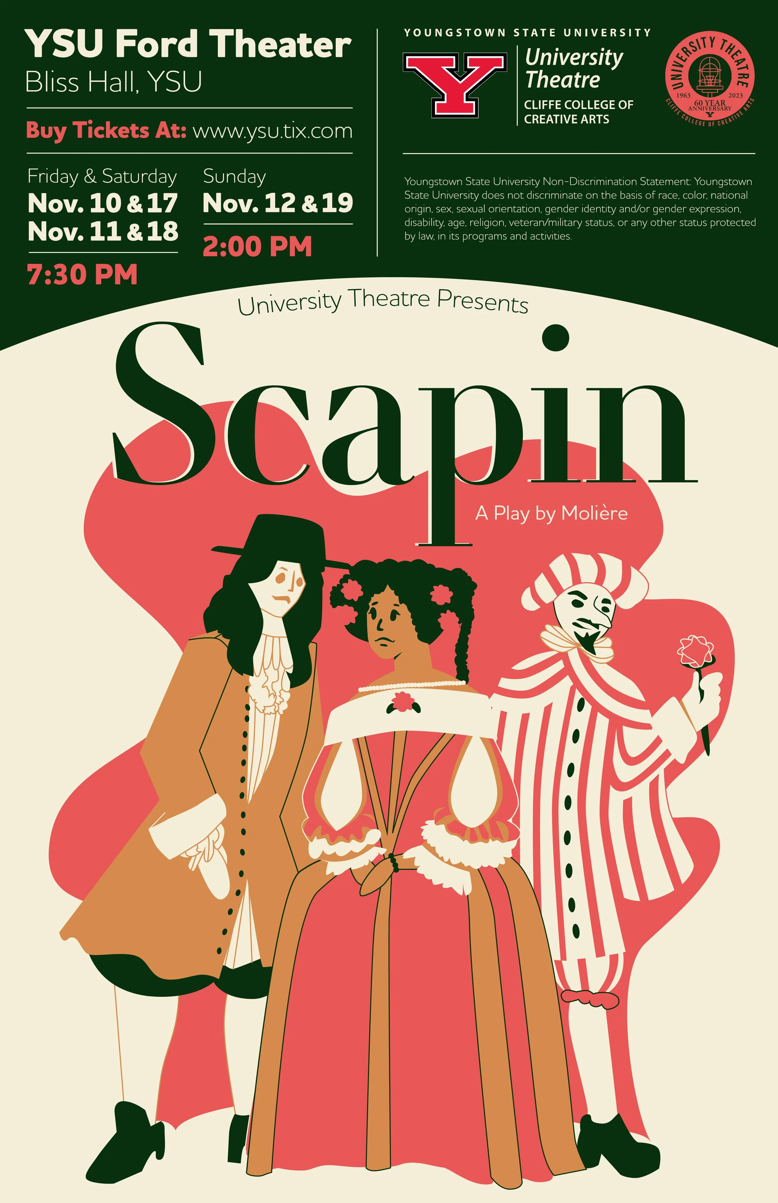
I created a few different versions of the poster, playing with layouts and composition. We found out during this that the writers who adapted the play’s names had to be half the size of the title. This created some challenges with the layout, but I was able to solve it by shrinking “written by” and “&”. Surprisingly, Moliere’s name did not have a size requirement, which helped the design. To finish off the design, I added a grain texture to give the large flat shapes a little bit more life.
